My Site Inspiration
published: January 27, 2025
tags:
static-websites |
design |
inspiration |
reading time: 2 minutes
This note documents the inspirations behind the design of my personal website, which has undergone two iterations thus far.
Initial version of my Personal Site
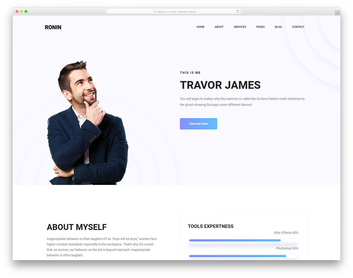
I created my initial version of my personal site in September 2022 by implementing elements of the colorlib template Ronin.

I wanted to create a personal site but didn’t know where to get started with the design process so I decided to go for the mimic approach.
Good artists copy. Great artists steal. - Pablo Picasso
I feel at this point in my web development journey I preferred to mimic or work with templates as designing from scratch felt intimidating.
I was drawn to the Ronin template as it looked simple and professional.
To view screenshots of the old site design check out the Sheriff’s Museum
Current site
It started with an obsession with the Silo’s computers
I am a fan of Apple TV+’s sci-fi series Silo.
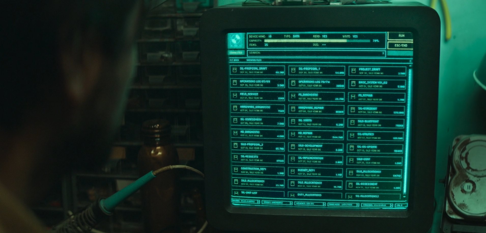
So when I decided to redesign my personal site, I started with this photo from the TV show:

I loved that the operating system had a green base colour and sprinkles of orange just like the Hacker Bytes colour palette. I also loved the simplicity of the design and just how “old school” it looked.
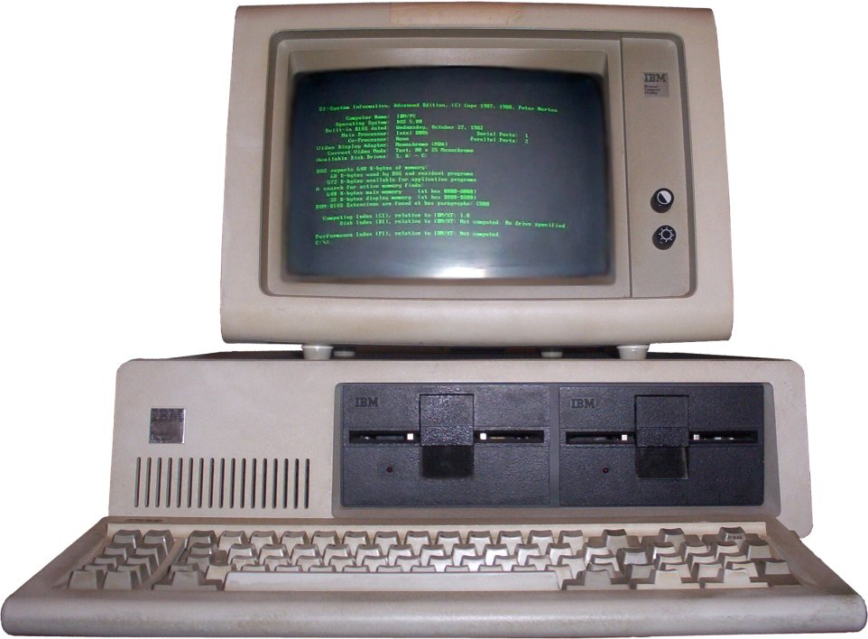
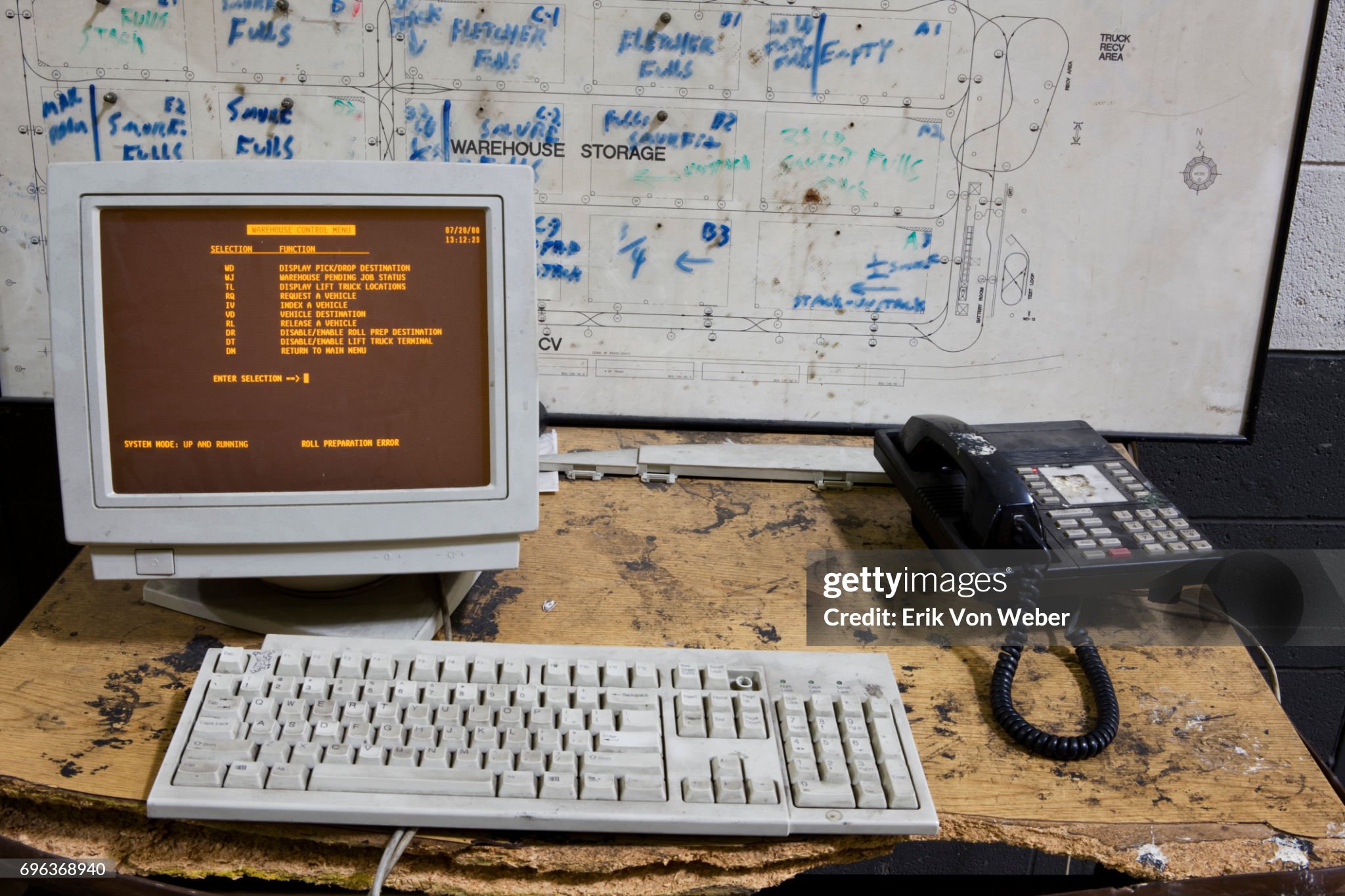
To expand on this design idea I then googled images of old monochrome PCs:


This inspiration led to:
- Bash navigation system. I wanted to be able to get around this blog without using the mouse hence the introduction of:
- ls
- cat
- history -c
- using arrows to view previously executed commands
- using arrows to navigate image galleries
- Fixed size list view that requires you to scroll the items. I wanted the User to remain in one place and hence have the header, list view content and footer appear fixed. I wanted the design to feel minimalist, to have a limited feel to it.
- A focus on using as few colours as possible: green, orange, white and grey. I initially wanted to push for a full monochrome palette actually.
Design concerns:
- Bash navigation system. Though I think it’s cool and I will be able to use it, it’s unclear yet how I will let visitors experience this feature.
- Not everyone’s cup of tea. The design is very nerdy and tech-based which might appear very strange to non-programmers. I intend to share some of my posts with students, I wonder how the User Experience will be for them.
Other influences
- Whenever I am stuck on how to position an element or display something I started by looking at how Guide Fari had implemented it. He doesn’t call his personal site a blog or even a personal site, just a digital garden. When I started the redesign I was not looking to create a blog or digital CV, just a space to be myself online so he’s site design had a similar underlying philosophy.
- Elements from Brittany Chiang’s blog inspired my Project display page.
- Elements from Jamie Zawinski’s blog inspired my About page.